Check back soon
Once posts are published, you’ll see them here.
Lauren Jones


BRIEFING
We were briefed for our final major project and from the get go it was obvious that this brief was very much up to ourselves to pick topics and different platforms and techniques we wanted to use. I automatically knew I wanted to do my project photography based as I know that is what I want to do when leaving and uni and am best at in my opinion. So although I knew I wanted to use photography as a main element in my work I was unsure on what my issue or outcomes would be.
INITIAL IDEAS
I began by brain storming ideas and scrolling through my photography Instagram page, Pinterest and Behance for inspiration until I came up with the idea of creating my own photography magazine. I follow a lot of fashion photography magazines ranging from small independent to huge international magazines e.g. vogue, POP, Hunger etc. I love the layout of the magazines and the general quality of them. I also love how each page is different and no two double page spreads are the same. So I jotted down a plan for my own magazine one that would have a range of social issues ranging from mental health, diet, fashion, photography etc. I wanted to open up submissions on social media and allow illustrators, designers, photographers to submit their work that correlated to my submission brief I would put out there.


I pitched this idea to Xavi and Brian and although they liked the idea of using photography as it was a strong point of mine they both agreed that having others work being submitted is not showing off or using my skills to their potential, which I agreed with. They also thought that I could be more adventurous with it and told me to question what would make my magazine stand out amongst thousands of others?
So from this I went back to the drawing board and again jotted down the elements that I liked from my original idea and that I wanted to keep and got rid of the others that wouldn't benefit me in anyway e.g. submissions.
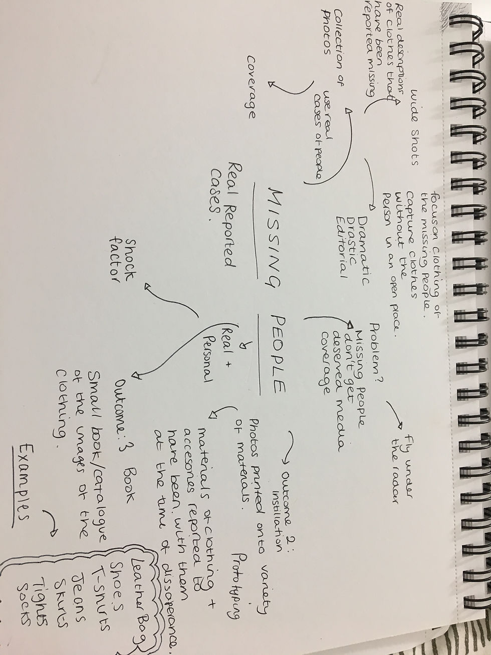
I wrote down a list of topics that I felt socially were important to me or were popular at the time and I began to look at the idea of missing people. What sparked my interest was seeing a tweet about a missing boy in the UK where his picture and description was being shared about. I started to think about the whole concept of a ‘missing person’. Where were these people? How can people just disappear and never be seen again? It sparked a genuine interest and I wanted to know more so I began researching into global missing people cases and statistics. I found out that somebody is reported in the UK every 90 seconds which fuelled my interest even more.
I pitched to a small group and Brian about my competition brief and also touched on my missing people idea for FMP even though I was unsure what direction I wanted to take it, I wanted to get opinions and any suggestions anybody from the group might have. Brian thought that it would be an interesting route to go down and to go back to have a think about what I could do to make my idea different and more 'out there'.
I began thinking about materials and printing and possibly printing onto leather and plastic however when I thought about this idea more I felt that I would be taking away from the photography itself and that it would make it more about the print and materials which is not really what I was going for. I finally came up with my final idea which was to merge my initial idea of a photography magazine / book and one of my final ideas of the subject of missing people and create a book filled with photography based on missing people.
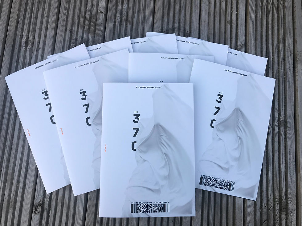
So I knew what I wanted to create but I was unsure which route to take it. I thought about having each double page spread being a different missing persons case or sticking to one case. I took some test photos based on the MH370 case, I researched into passengers on board and their occupations and reasons of travel and used hands to portray each individual. I wanted to have something to show before I explained my idea so that it could be understood visually and my art direction was clear. (These photographs actually ended up being used in my final book.)
Derek and Xavi both agreed that I should stick to MH370 and focus on one case throughout the book. They also both liked the art direction I had created and gone with so encourage me to continue with that.
After my chat with Derek and Xavi I felt motivated and happy with my content and was planning on my next moves and starting piecing together different stories from MH370.
MH370 : CASE FILES
As missing flight MH370 is a globally known case I knew that there was going to be archives of evidence, interviews, theories and scientific explanations. I started by watching all MH370 documentaries that are out there online. Coincidently a 5 years on documentary was broadcasted on Channel 5 just as I was brainstorming so it was perfect timing for me to get another insight and perspective on what happened and the case in general. Although the documentary was helpful in explaining different theories there are about the flight there was not much information about the passengers or their lives before the flight. This was something I was found that was re occurring was not having enough information on the people but finding so much about the Boeing 777 itself. As this was the case I had to dig a little deeper and found myself 15 pages deep online search engines and interview archives looking for information that has perhaps came from family members. I found a blog post written by one of the Wang's friends who wrote about them personally and why they were travelling, birthdays, occupations etc. This felt like a break through and I felt like I was getting somewhere. I found police interviews with family members and social media posts which helped me piece together who these passengers were. Once I could write a profile on numerous people the ideas for the shoots came to me and I began to just going out with my camera gathering objects for subjects and just shooting. I feel like I get some of my best work when I over shoot because I have so many options and I find I get a better picture in my head. In total I did around 10 separate shoot 6 of which made it into the book as I only wanted to print work I was happy with and was of good quality.


SHOOTS
HAND

My first shoot was 'HAND' I set up a 2 point lighting to create the shadow on one side of the hand. I felt the shadow was necessary as I knew i wanted these images to be black and white I knew the shadow would bring intensity to the photo.
When editing this photo I feel like the art direction just happened naturally, I started to play around with different typefaces and layouts and eventually created a boarding pass template to add onto all three images. Each one was carefully researched and the information was added on to the correlating image.
FOR MOTION DISCOMFORT
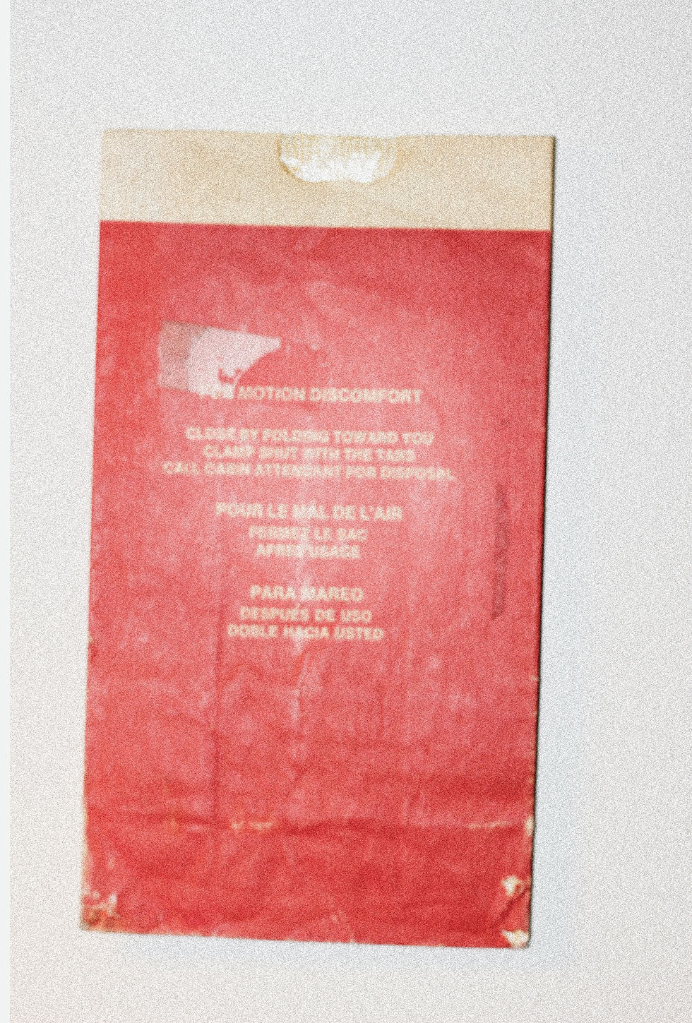
This shoot was a really great coincidence as someone I know has Europe's largest collection of aircraft sick bags. This allowed me to browse through all of the sick bags and photograph them. I went for an 'evidence' looking edit I added noise and blurs to them including adding a highlight in the centre to intensify the flash that was used.
BAGGAGE

When shooting for the baggage collection I shot over 100 images and only used four in the book. I took the same picture in different formations so I shot the jeans in four different locations, the bag of empty clothes in four different locations etc. I shot tools, medals, clothes, shoes, bags. I did this to get the best result and so I had options in the edit. I used the clone stamp tool in Photoshop to get rid of the original clothing tags and added in seat numbers and names to make it personal, from my research findings I found that most of the reports and documentaries were not very personal and lacked compassion for those lost which is why I wanted to use real names and seat numbers.
CONSPIRACY

When shooting for 'Conspiracy' I had researched a wide variety of theories and whittled it down to what theories would be suitable and would be interesting to shoot. There are hundreds of theories one of which is focused on a pilot assisted suicide, I didn't want to use any theory that puts the blame on somebody who cannot speak for themselves and out of general respect for the situation and family members. This theory was also debunked so it only felt right I went with a theory that was mainly just conspiracy and had element of factual evidence that could be potentially linked to the aircraft.
When it came to the edit I really enjoyed working with the colours in the images I dragged out the greens and highlights I also removed the head of the subject as a running theme in the book was to not feature any faces or full body shots as I wanted to capture personality and stories rather than faces. I wanted to create a picture of the who these people were and use photography to do so.
LOST GENERATIONS

Lost generations was actually shot on a very dull day despite the final image. I used the layer mask tool on photoshop to add in a new sky to add depth to the image as it was very flat with the one toned sky. The hats were held up for the first shot then I took the same photo without anybody in frame in order to use the layer mask and use the eraser tool on the layer mask.
ABSENCE

The final image on the last page is my favourite out of the six collections. I feel like this image is quite striking and emotional as the story is quite harrowing. I bought six helium balloons from a shop near by and used a mini child's stool. I again used the layer mask to add in the sky and played around with the colouring and highlighted the vibrant colours.
WEBSITE
I toyed around with wether to go for a website as my second deliverable as I was unsure at first how I could link it well enough however when I first showed Xavi, Derek and my friends my first few images they all instantly wanted to know more about the story behind it and the people they were based on. This gave me confirmation that people wanted to know more and were interested in finding out about the passengers. I wanted to create a book that was simplistic and only contained visuals and then create a website where the user/reader could find out more information on each collection of photographs online.
Inspiration

I'd made a few websites before but mainly for portfolio. I started out by purchasing my domain name 'www.mh370.co.uk' and connected to Wix and started to build my website. I did a lot of sketches and looking at other websites for inspiration and references. I found a few that had elements that I liked for example having a moving image on the home page, centred and bold text. I first roughly sketched out what my pages would look like and then designed them digitally. This gave me a great head start when it came to designing as I could go back and use them for reference, I also wasn't afraid to make changes along the way as my designs were more guidelines of what I had in mind however somethings don't' always look as good as they do in your head so a few minor adjustments were made e.g. the border of text was bought inwards more and the 'Enter' button was enlarged.


FEEDBACK
I asked friends, family and anybody that was interested to take a look at my website on both desktop and mobile and let them navigate freely through the website, I then asked for feedback on how easy or difficult they found it and if there was anything they liked or disliked. Everybody who visited the website said that they liked the home page and that having a moving background was a really nice feature and they felt it was captivating and different. Somebody mentioned that on mobile it was not an option to hover over the images like it was on desktop so I changed my collections page on the mobile version so that hovering wasn't an option and the collection names and descriptions were the first thing seen instead of fidgeting with a hover button to make the user experience smoother.
PRINTING
At my last tutorial session with Derek we discussed printing and print shops I could contact and potential materials I could use. I used big sheets of A3 to see if I would want it to be more newspaper style and then also collected some card and other materials and played around with having a tiny hand book. I first was set on the idea of having an A5 book but I didn't want to compromise on the image quality so I decided to go for an A4 full colour. I knew that I was going to be going back home to Birmingham over the Easter break so began to look for print shops local to me. I sent a few emails and made a few phone calls and decided to go for a company called Big in INK that was actually only five minutes away so it was super convenient. I popped in to talk about materials, turn around on printing and how they wanted my files to be sent over etc.
To be quite honest I felt out of my depth when it came to the printing side of things as I'd never printed a book or really known the ins and outs of indesign however I feel like I really did learn so much whilst speaking back and forth with Big in Ink and also designing the book on indesign over the months. I picked up the books and was actually printed 5 more than expected so that was a bonus. I was really happy with the quality of the images and paper.


OVERALL
For me this project has been a turning point, I feel that working independently on this project has made me a stronger creative and I have learned so much from it. I started out not knowing a single thing about printing to having a finished A4 full colour printed book filled with my own photography. Something that has been a negative for me is a small printing error on the first page. I kicked myself for days over it after I picked up the books but I knew that I shouldn't dwell on it as these things happen and there was nothing I could do as it would be too short notice to have them re-printed as well as an extra cost.
I am so glad I chose to stick with my idea of creating a photography book as I knew that was where my passion lay, sometimes it's easy to feel mediocre amongst a group of people who are skilled in a similar area so to do something different and pursue something I enjoy the most was really rewarding. I am really proud of both of my outcomes and am happy to add them to my portfolio!


Comments